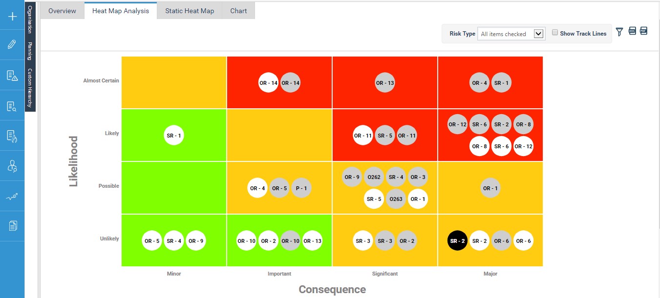
Heat Map Dashboard will visualize your organization’s risks across its ratings enabling you to click on them to enable track lines and time line trends which shows its movement across the matrix over time and assessments is now available within cammsrisk.
This can be found in a new tab called ‘Heatmap Dashboard’ in ‘Risk Analysis’ section of the left hand quick navigation menu.
This allows you to:
1. Visualise your organization’s risks across its ratings at different levels of assessment in a heat map.

Note: This will be automatically generated based on the risk matrix configurations done for the current/revised risk assessment within the application.
2. Visualise the track line for a risk which shows the movement of the risk across the matrix over the assessments.
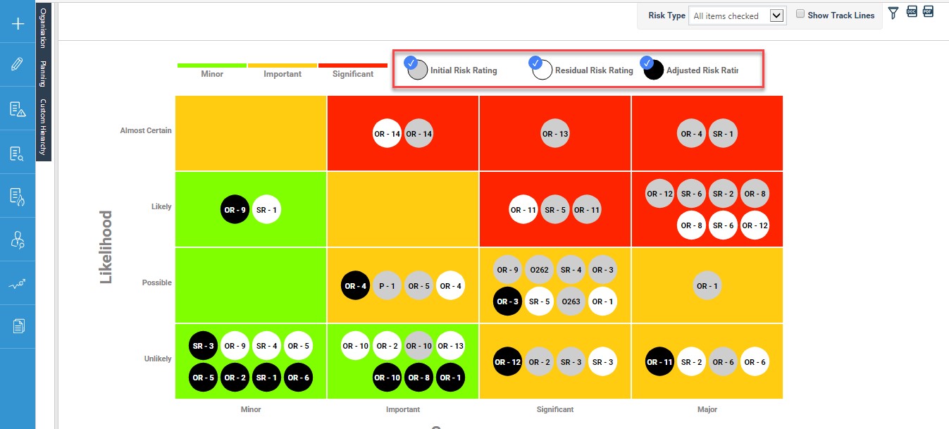
Risks at the three assessment levels would be shown in the colour coding below and a track line to show the movement of the risk from initial, revised to future assessment levels is shown in the track line view.
- Initial Risk Assessment – shown using grey
- Revised Risk Assessment – shown using white
Future Risk Assessment – shown using black
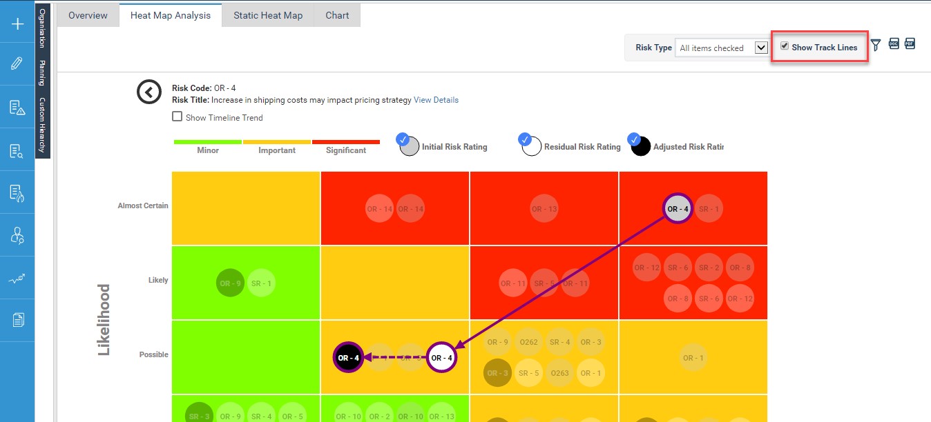
Note: You can view the track lines for all risks within the dashboard in one view or click on a specific risk and view the track line for any risk individually.
3. Visualise the timeline trend for the risk by clicking on the ‘Show Timeline trend’ check box and this would show the movement of the risk rating during the selected course of time for which the heat map analysis area is filtered to.
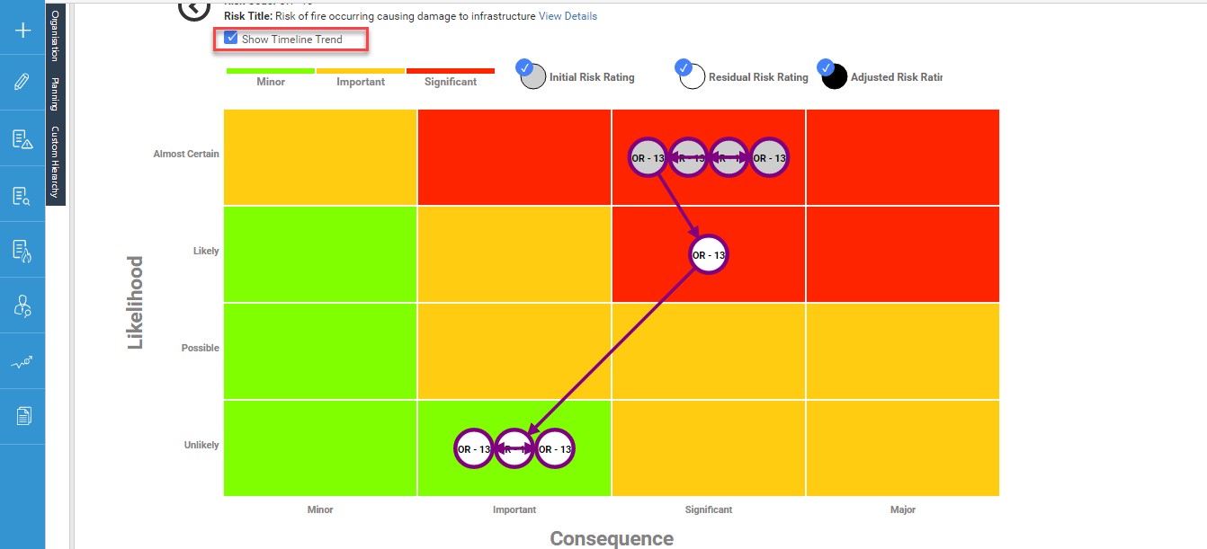
Note: You can view the timeline trend for all risks within the dashboard in one view or click on a specific risk and view the timeline trend for any risk individually.
4. A detailed view of each risk shown within your heat map can be accessed via ‘View Details’ option

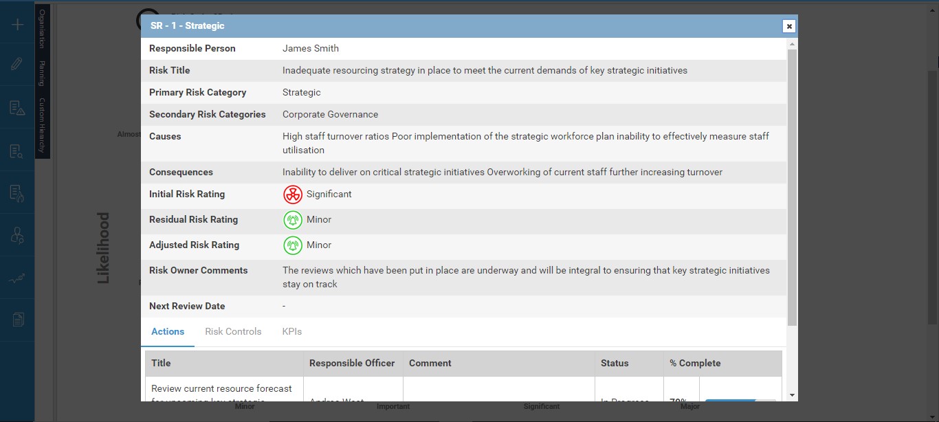
Note: This would show below details for the risk
a. Risk Type
b. Risk Code
c. Risk Title
d. Responsible Person
e. Primary Risk Category
f. Secondary Risk Category
g. Causes
h. Consequences
i. Initial Rating
j. Revised Rating
k. Future Rating
l. Next Review Date
m. Risk Owner Comments
n. Management Comments
o. Actions
p. KPIs
q. Risk Controls
5. This dashboard will have the following filter options to customise the data shown within it:
Risk Rating Legend – This would show the colours in the heat map and the risk ratings each colour represents. This would be based on the configurations for the criteria from within the application.
· Filter out the risks shown in the heat map dashboard in terms of assessment levels for risks.
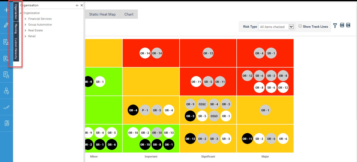
View/Filter your organizations’ risks within the analysis dashboard by hierarchies set up within the application
- Organization Hierarchy
- Planning Hierarchy and
- Custom hierarchies
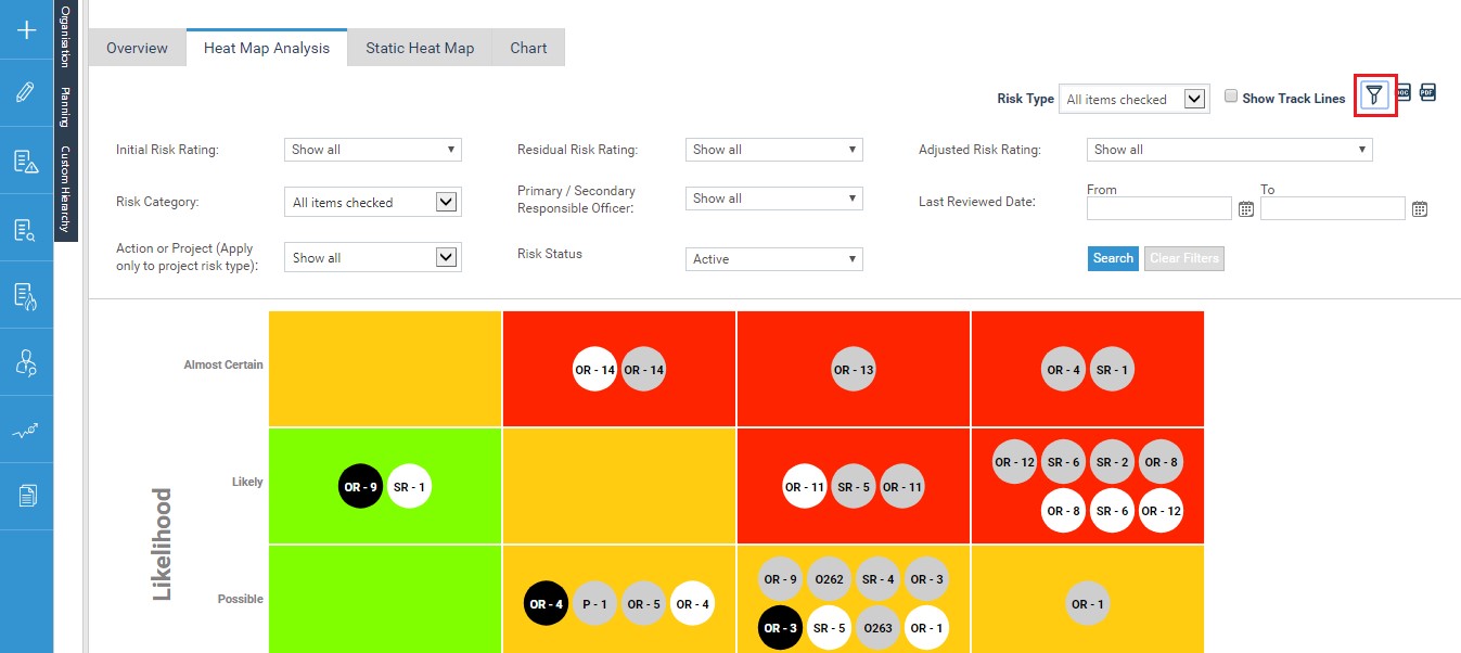
Filter out your risks shown in the heatmap dashboard using multiple other filtration options including
- Risk type
- Risk Category
- Primary/Secondary Responsible person
- Assessment ratings
- Risk Status etc. and have multiple views of the same dashboard based on what you need to analyze on.
- You will also be able to select the date range and view the heatmap dashboard for any desired reporting period. The timeline trends would be shown accordingly.
Note: Any filtrations configured for the main heat map area would be available here for the timeline trend analysis area.
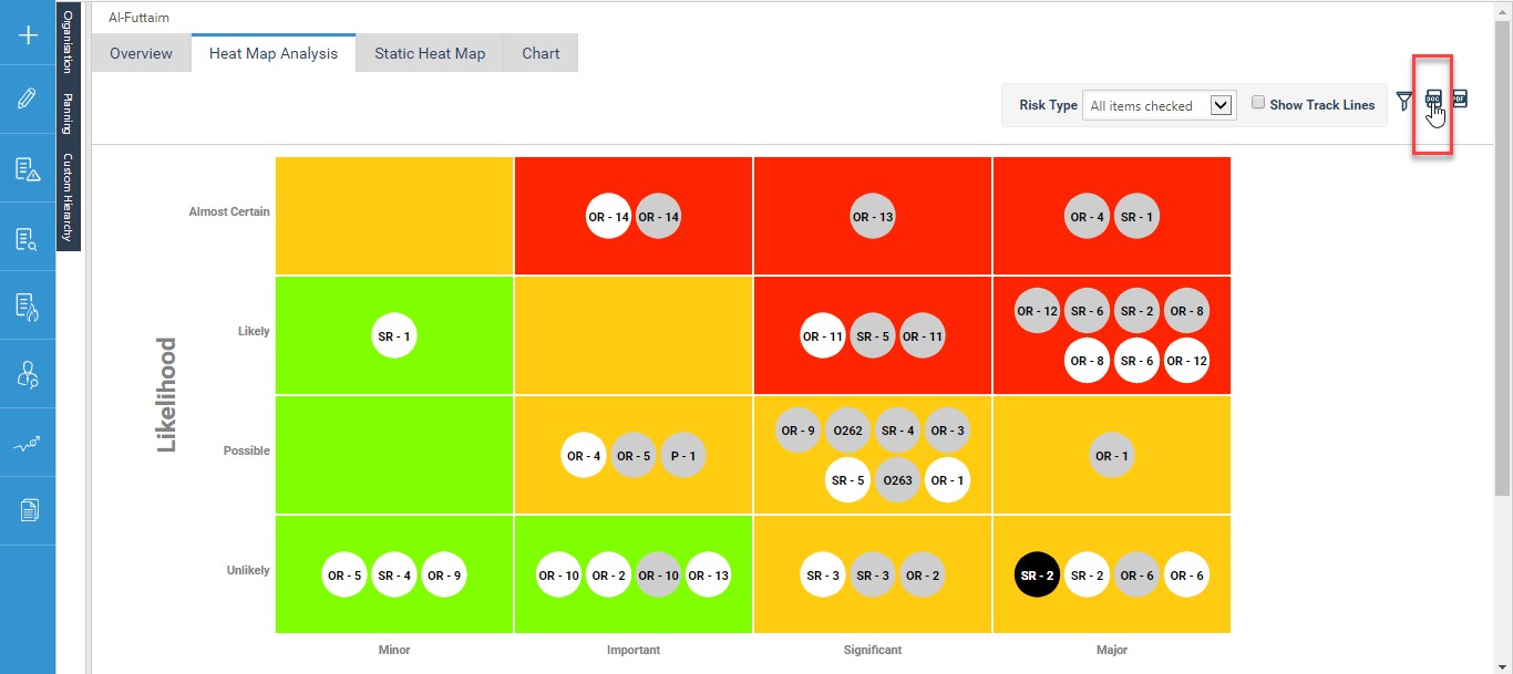
6. Ability to export the current view of the heat map to a PDF, word or Image export by clicking on the export button.
Copyright © 2014-2015 CAMMS Online Help. All rights reserved.
Last revised: September 23, 2018